What are we going to learn?
During this session, you will:
- Have a visualisation package installed (ggplot2)
- Learn how to explore data visually
- Learn about the 3 essential ggplot2 components
- Use different kinds of visualisations
- Layer several visualisations
- Learn how to customise a plot with colours, labels and themes.
Essential shortcuts
Remember some of the most commonly used RStudio shortcuts:
- function or dataset help: press F1 with your cursor anywhere in a function name.
- execute from script: Ctrl + Enter
- assignment operator (
<-): Alt + -
Material
If you haven’t loaded the whole Tidyverse yet, we can load the ggplot2 package on its own by running the following command:
library(ggplot2)Remember to use Ctrl+Enter to execute a command from the script.
Introducing ggplot2
The R package ggplot2 was developed by Hadley Wickham with the objective of creating a grammar of graphics for categorical data (in 2007). It is based on the book The Grammar of Graphics Developed by Leland Wilkinson (first edition published in 1999).
It is now part of the group of data science packages called Tidyverse.
The components of the Grammar of Graphics
The Grammar of Graphics is based on the idea that you can build every graph from the same few components.
The components are:
- Data
- Mapping
- Statistics
- Scales
- Geometries
- Facets
- Coordinates
- Theme
In this introductory session, we will mainly focus on the data, the mapping, the statistics, the geometries and the theme.
ggplot2’s three essential components
In ggplot2, the 3 main components that we usually have to provide are:
- Where the data comes from,
- the aesthetic mappings, and
- a geometry.
For our first example, let’s use the msleep dataset (from the ggplot2 package), which contains data about mammals’ sleeping patterns.
You can find out about the dataset with
?msleep.
Let’s start with specifying where the data comes from in the ggplot() function:
ggplot(data = msleep)
This is not very interesting. We need to tell ggplot2 what we want to visualise, by mapping aesthetic elements (like our axes) to variables from the data. We want to visualise how common different conservations statuses are, so let’s associate the right variable to the x axis:
ggplot(data = msleep,
       mapping = aes(x = conservation))
ggplot2 has done what we asked it to do: the conservation variable is on the x axis. But nothing is shown on the plot area, because we haven’t defined how to represent the data, with a geometry_* function:
ggplot(data = msleep,
       mapping = aes(x = conservation)) +
  geom_bar()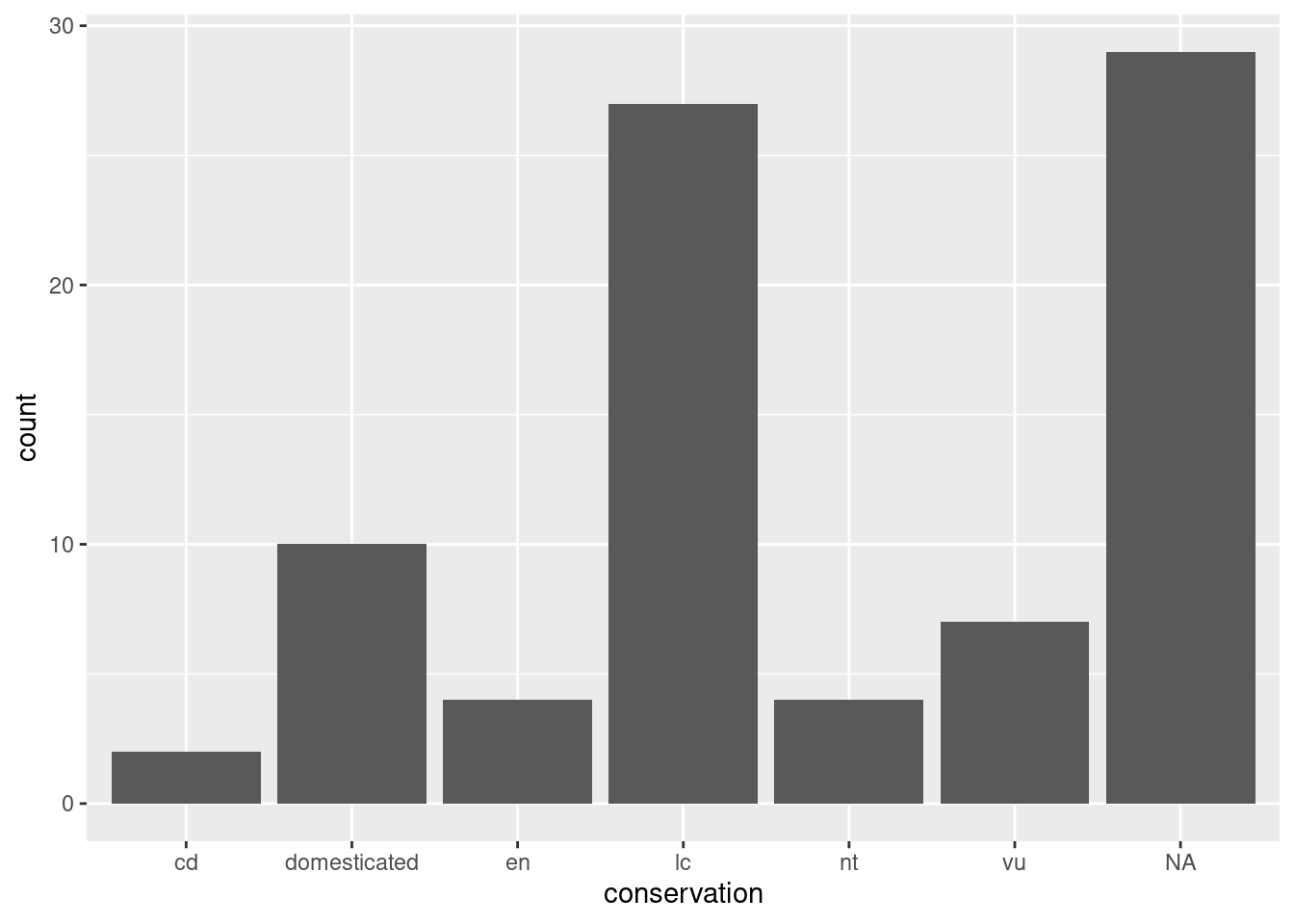
Now we have a useful plot: we can see that a lot of animals in this dataset don’t have a conservation status, and that “least concern” is the next most common value.
We can see our three essential elements in the code:
- the data comes from the
msleepobject; - the variable
conservationis mapped to the aestheticx(i.e. the x axis); - the geometry is
"bar", for “bar chart”.
Here, we don’t need to specify what variable is associated to the y axis, as the “bar” geometry automatically does a count of the different values in the conservation variable. That is what statistics are applied automatically to the data.
In ggplot2, each geometry has default statistics, so we often don’t need to specify which stats we want to use. We could use a
stat_*()function instead of ageom_*()function, but most people start with the geometry (and let ggplot2 pick the default statistics that are applied).
Scatterplots
Let’s have a look at another dataset: the penguins dataset from the palmerpenguins package.
library(palmerpenguins)
penguins
## # A tibble: 344 × 8
## species island bill_length_mm bill_depth_mm flipper_length_mm body_mass_g
## <fct> <fct> <dbl> <dbl> <int> <int>
## 1 Adelie Torgersen 39.1 18.7 181 3750
## 2 Adelie Torgersen 39.5 17.4 186 3800
## 3 Adelie Torgersen 40.3 18 195 3250
## 4 Adelie Torgersen NA NA NA NA
## 5 Adelie Torgersen 36.7 19.3 193 3450
## 6 Adelie Torgersen 39.3 20.6 190 3650
## 7 Adelie Torgersen 38.9 17.8 181 3625
## 8 Adelie Torgersen 39.2 19.6 195 4675
## 9 Adelie Torgersen 34.1 18.1 193 3475
## 10 Adelie Torgersen 42 20.2 190 4250
## # … with 334 more rows, and 2 more variables: sex <fct>, year <int>Learn more about it with ?penguins, and have a peak at its structure with:
str(economics)## spec_tbl_df [574 × 6] (S3: spec_tbl_df/tbl_df/tbl/data.frame)
## $ date : Date[1:574], format: "1967-07-01" "1967-08-01" ...
## $ pce : num [1:574] 507 510 516 512 517 ...
## $ pop : num [1:574] 198712 198911 199113 199311 199498 ...
## $ psavert : num [1:574] 12.6 12.6 11.9 12.9 12.8 11.8 11.7 12.3 11.7 12.3 ...
## $ uempmed : num [1:574] 4.5 4.7 4.6 4.9 4.7 4.8 5.1 4.5 4.1 4.6 ...
## $ unemploy: num [1:574] 2944 2945 2958 3143 3066 ...Scatterplots are often used to look at the relationship between two variables. Let’s look at the relationship between bill length and bill depth:
ggplot(data = penguins,
       mapping = aes(x = bill_length_mm,
                     y = bill_depth_mm)) +
    geom_point()
## Warning: Removed 2 rows containing missing values (geom_point).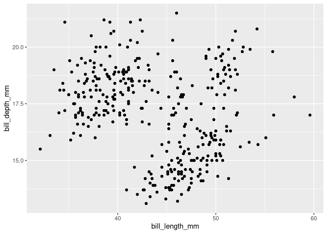
Let’s go through our essential elements once more:
- The
ggplot()function initialises a ggplot object. In it, we declare the input data frame and specify the set of plot aesthetics used throughout all layers of our plot; - The
aes()function groups our mappings of aesthetics to variables; - The
geom_<...>()function specifies what geometric element we want to use.
It’s hard to see any kind of trend in there, but we might be missing something, so let’s add a trend line on top.
Layering
A trend line can be created with the geom_smooth() function. How can we combine several layers? We can string them with the + operator:
ggplot(data = penguins,
       mapping = aes(x = bill_length_mm,
                     y = bill_depth_mm)) +
  geom_point() +
  geom_smooth()
## `geom_smooth()` using method = 'loess' and formula 'y ~ x'## Warning: Removed 2 rows containing non-finite values (stat_smooth).## Warning: Removed 2 rows containing missing values (geom_point).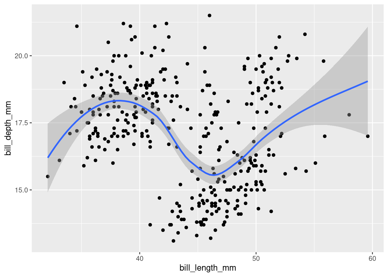
The console shows you what function / formula was used to draw the trend line. This is important information, as there are countless ways to do that. To better understand what happens in the background, open the function’s help page and notice that the default value for the method argument is “NULL”. Read up on how it automatically picks a suitable method depending on the sample size, in the “Arguments” section.
Want a linear trend line instead? Add the argument method = "lm" to your function:
ggplot(data = penguins,
       mapping = aes(x = bill_length_mm,
                     y = bill_depth_mm)) +
  geom_point() +
  geom_smooth(method = "lm")
## `geom_smooth()` using formula 'y ~ x'## Warning: Removed 2 rows containing non-finite values (stat_smooth).## Warning: Removed 2 rows containing missing values (geom_point).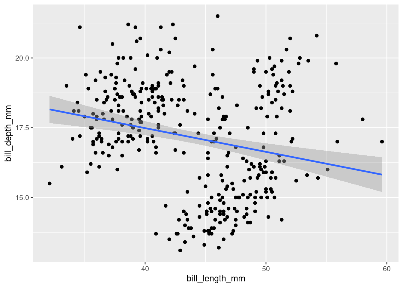
A linear model makes it look like the relationship is negative… We might have to reveal more information to have a better understanding of it.
Adding aesthetics
We can highlight the “species” factor by adding a new aesthetic:
ggplot(data = penguins,
       mapping = aes(x = bill_length_mm,
                     y = bill_depth_mm,
                     colour = species)) +
  geom_point() +
  geom_smooth(method = "lm")
## `geom_smooth()` using formula 'y ~ x'## Warning: Removed 2 rows containing non-finite values (stat_smooth).## Warning: Removed 2 rows containing missing values (geom_point).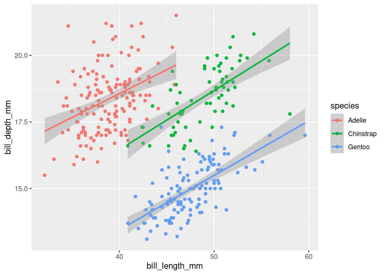
It now makes a lot more sense: by splitting the data into different species, we can see that the two variables a positively correlated. The longer the beak, the deeper it usually is. We just witnessed Simpson’s paradox, in which omitting important variables in the analysis leads to inaccurate interpretations.
The order of the functions matters: the points will be drawn before the trend line, which is probably what you’re after.
Challenge 1 – where should aesthetics be defined?
Take the last plot we created:
ggplot(data = penguins,
       mapping = aes(x = bill_length_mm,
                     y = bill_depth_mm,
                     colour = species)) +
  geom_point() +
  geom_smooth(method = "lm")
How would you go about going back to drawing one single trend line for the whole population?
Hint: see ?geom_point()
Different geometries can also have their own mappings that overwrite the defaults. If you place mappings in a geom function, ggplot2 will treat them as local mappings for the layer. It will use these mappings to extend or overwrite the global mappings for that layer only. This makes it possible to display different aesthetics in different layers.
Saving a plot
Like your visualisation? You can export it with the “Export” menu in the “Plots” pane.
- Building a document or a slideshow? You can copy it straight to your clipboard, and paste it into it.
- A PDF is a good, quick option to export an easily shareable file with vector graphics. Try for example the “A5” size, the “Landscape” orientation, and save it into your “plots” directory.
- More options are available in the “Save as image…” option. PNG is a good compressed format for graphics, but if you want to further customise your visualisation in a different program, use SVG or EPS, which are vector formats. (Try to open an SVG file in Inkscape for example.)
To save the last plot with a command, you can use the ggsave() function:
ggsave(filename = "plots/bills.png")This is great to automate the export process for each plot in your script, but ggsave() also has extra options, like setting the DPI, which is useful for getting the right resolution for a specific use. For example, to export a plot for printing on a poster, you can use a higher definition with the dpi argument:
ggsave(filename = "plots/bills_poster.png", dpi = 600)Challenge 2 – compare the distribution of flipper lengths
A few geometry functions can help us explore how different species have different flipper lengths:
geom_histogram()geom_density()geom_boxplot()
Pick one geometry, try to build a visualisation by matching aesthetics with variables, and share your code with others!
Faceting
Faceting is a powerful feature that often allows to fit another variable into your visualisation.
For example, imagine that you start looking a body mass in different sexes with a boxplot:
ggplot(penguins, aes(x = sex, y = body_mass_g, colour = sex)) +
  geom_boxplot()
## Warning: Removed 2 rows containing non-finite values (stat_boxplot).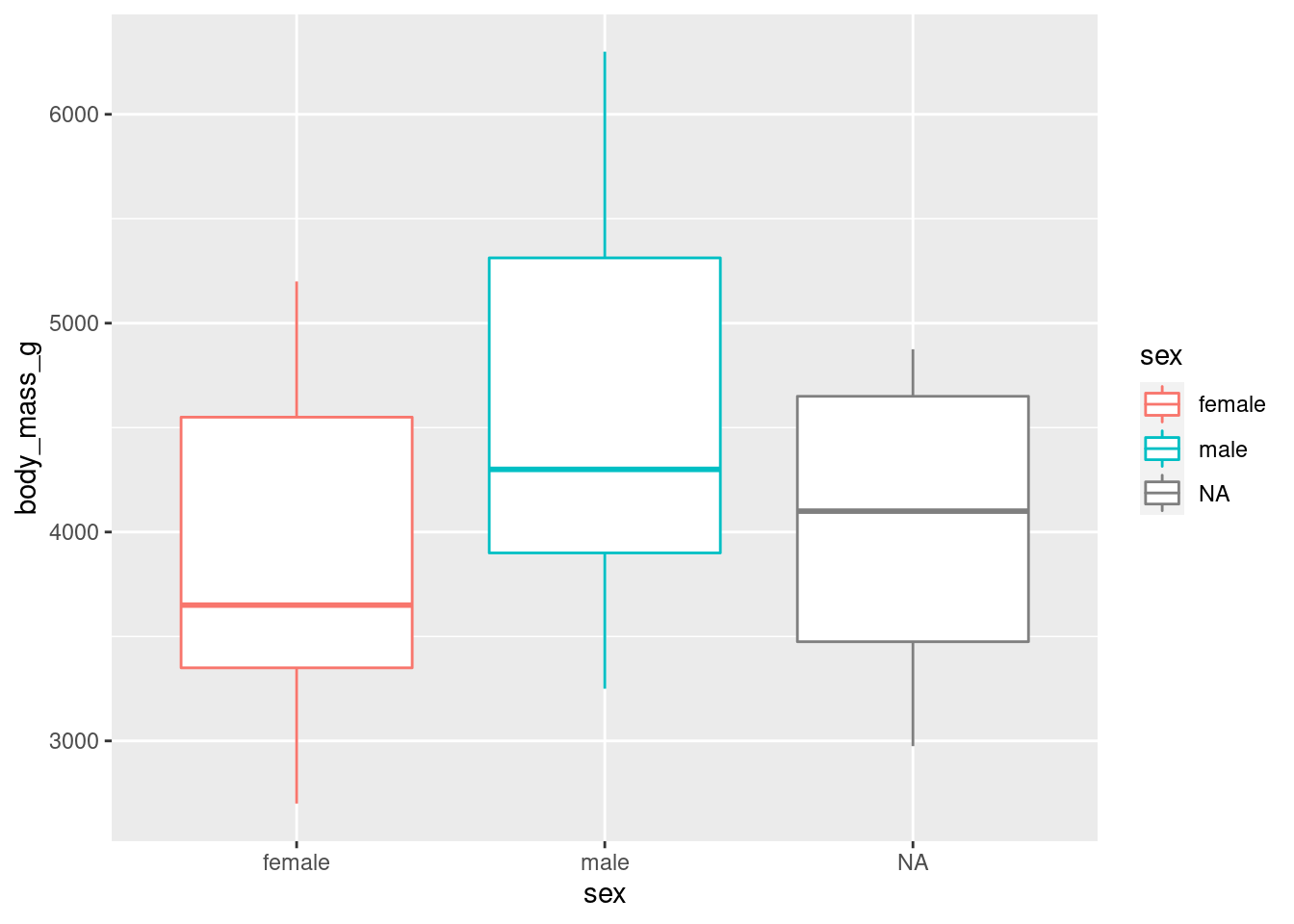
We stopped using the argument names because we know in which order they appear: first the data, then the mapping of aesthetics. Let’s save ourselves some typing from now on!
Once more, we might want to add an extra variable to better differentiate different populations:
ggplot(penguins, aes(x = sex, y = body_mass_g, colour = sex)) +
  geom_boxplot() +
  facet_wrap(vars(species))
## Warning: Removed 2 rows containing non-finite values (stat_boxplot).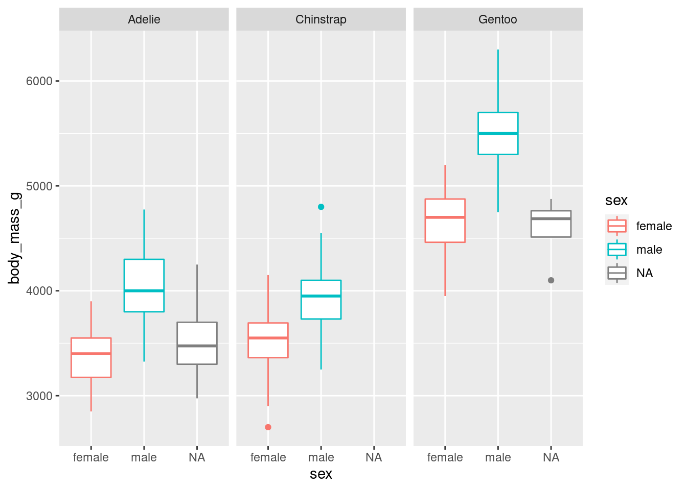
As there are three species, the visualisation was split into three facets. We can now see a clearer separation between sexes.
Notice how all the axes are synced? This is a good default, because it allows you to compare data across facets, but you can customise that if you want with the scales argument.
Customising a plot
Let’s see how we can customise our boxplot’s look.
Change a geometry’s default colour
First, we can pick our favourite colour in geom_boxplot():
ggplot(penguins, aes(x = sex, y = body_mass_g, colour = sex)) +
  geom_boxplot(fill = "cornsilk") +
  facet_wrap(vars(species))
## Warning: Removed 2 rows containing non-finite values (stat_boxplot).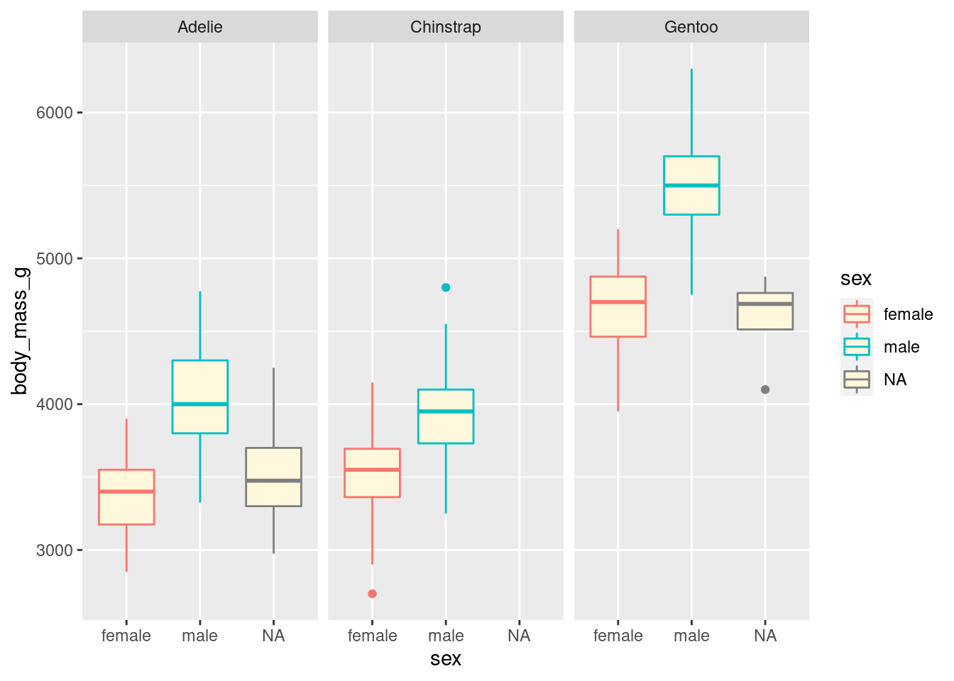
If you are curious about what colour names exist in R, you can use the colours() function.
Change labels
We can also modify labels with the labs() function, as variable names are not always nice to read.
Let’s have a look at what labs() can do:
?labsIt can edit the title, the subtitle, the x and y axes labels, the caption, and importantly: the alternative text.
ggplot(penguins, aes(x = sex, y = body_mass_g, colour = sex)) +
  geom_boxplot(fill = "seashell") +
  facet_wrap(vars(species)) +
  labs(x = "Sex",
       y = "Body mass (g)")
## Warning: Removed 2 rows containing non-finite values (stat_boxplot).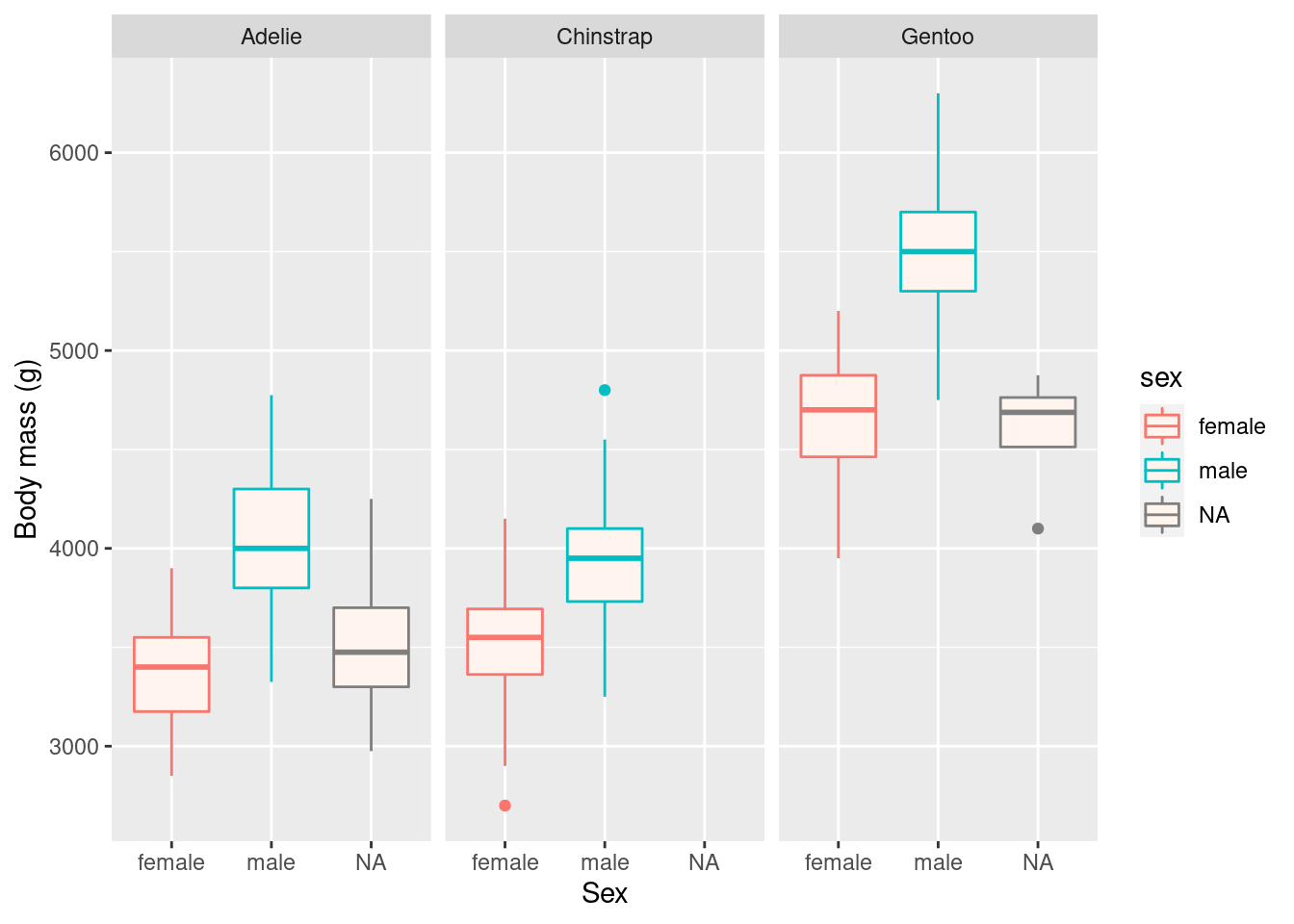
Remember that captions and titles are better sorted out in the publication itself, especially for accessibility reasons (e.g. to help with screen readers).
Themes
The theme() function allows us to really get into the details of our plot’s look, but some theme_*() functions make it easy to apply a built-in theme, like theme_bw():
ggplot(penguins, aes(x = sex, y = body_mass_g, colour = sex)) +
  geom_boxplot(fill = "seashell") +
  facet_wrap(vars(species)) +
  labs(x = "Sex",
       y = "Body mass (g)") +
  theme_bw() + # apply a built-in theme
  theme(legend.position = "none") # further customise: remove the superfluous legend
## Warning: Removed 2 rows containing non-finite values (stat_boxplot).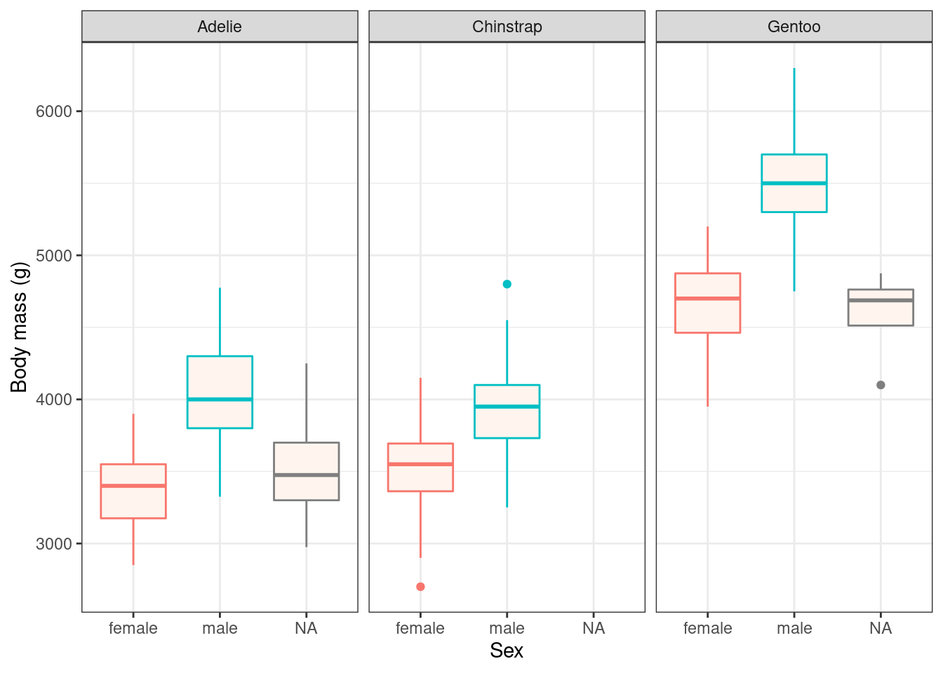
Try theme_minimal() as well, and if you want more options, install the ggthemes package!
Play time!
Challenge 3: explore geometries
When creating a new layer, start typing geom_ and see what suggestions pop up. Are there any suggestions that sound useful or familiar to you?
Modify your plots, play around with different layers and functions, and ask questions!
Close project
Closing RStudio will ask you if you want to save your workspace and scripts. Saving your workspace is usually not recommended if you have all the necessary commands in your script.
Useful links
- For ggplot2:
- ggplot2 cheatsheet
- Official ggplot2 documentation
- Official ggplot2 website
- Chapter on data visualisation in the book R for Data Science
- Selva Prabhakaran’s r-statistics.co section on ggplot2
- Coding Club’s data visualisation tutorial
- Cookbook for R graphs
- STHDA’s ggplot2 essentials
- Our compilation of general R resources